Before the brand, a need
The earliest notes call the project “WhatsApp Commerce Bot”. The question was specific: how to make a purchase easier when it starts in a WhatsApp catalogue and requires several messages to confirm an order.
The idea of connecting that conversation to a visual store gave us a starting point for the identity: making the move from discussing an order to buying it recognisable.
The project went through the name ComerChat before becoming Chat2Store. When we started the brand kit, a prototype and visual styles already existed. We chose to clarify the brand before expanding it further: keep what made sense and give the name, colours and personality a shared direction.
A name that describes the journey
One condition stayed with us throughout the naming conversation: “chat” had to remain, because it was the essence of the product. We wanted to reconsider ComerChat because its reading as “comer”, Spanish for “to eat”, plus “chat” could suggest food and restaurants too strongly.
We tried alternatives including CarritoChat and ChatKato, saying them aloud as well as looking at them. Some worked better in writing than in speech; others suggested a social network or moved away from commerce.
Chat2Store brought together the two ends we wanted: the conversation and the store. There was a specific reason to choose “store”: the proposed experience prioritised collecting orders at the shop. The name could describe both moving into a digital mini store and arriving at a physical shop.
The Spanish tagline makes that connection explicit:
Del chat a la tienda. — From chat to store.
The line introduces the concept before explaining how the product would work. Talking, choosing and buying are familiar actions; the brand brings them together in one direction.
Kato found a role of its own
After setting ChatKato aside as the main name, we wanted to keep Kato as a mascot. We separated the roles: Chat2Store would explain the commercial proposition, while Kato would bring personality as the brand’s character and assistant.
Kato let us keep the approachable side of a discarded name and give it a place of its own within the identity.
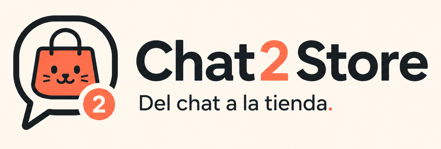
The symbol combines a speech bubble with a shopping bag. The bag includes a cat face, while a small circular badge repeats the “2” from the name.
The composition can be read in parts: the bubble suggests chat, the bag suggests a store and Kato’s face adds an expressive detail. Together, they give the identity an approachable tone that carries through to its icon and avatar versions.

Coral on a warm base
The kit defines a cream canvas (#F4EFE4), a light surface (#FFFAF0), dark ink (#15130F) and coral (#FF5A36). In the approved logo, coral appears on the bag, the “2” and the full stop at the end of the tagline.
Dark lettering anchors the name against the light background. The dark-background version preserves the composition and adapts the light elements to keep the identity recognisable.
Applications and consistency
The available work includes horizontal versions with and without the tagline, a standalone symbol, light and dark variants, favicons, application icons and social profile materials.
Exploration continued with business cards and landing page proposals in image form. The reviews emphasised two things: preserve the chosen logo and composition when preparing other formats, and reduce the landing page’s density when it tried to explain too many parts of the product at once.
We chose to work from one approved image and preserve its shapes across applications. The kit available at this stage is in PNG format; it provided a shared visual reference while we explored the different formats.
An identity to build on
Chat2Store is a Resaltiva internal project. This case covers its branding stage: the name, Kato’s role, the logo, palette and visual applications. The product explorations provide the context from which the brand emerged.
The outcome of that stage is an identity that connects its name with its symbol: Chat2Store describes the journey, the bag and bubble represent it, and Kato adds personality. A foundation for the project’s continued development.