It began with a simple request
Before it had a name, Resaltiva began with a scenario: someone has a promotion for their business and needs to communicate it. “This Friday: mojitos 2-for-1” was the example we used. One sentence could become a concept, an image, copy and formats ready to publish.
It was a service example, rather than a client commission. It helped us make the idea specific: give people a way in when they know what they want to promote but may not know how to request a key visual or write a creative brief.
Early conversations also explored a conversational experience. We chose to start with the service and keep platform development from delaying the launch. First, we needed a clear offer, a brand and somewhere to show it.
A promise before a tool
The initial idea described creative services using AI. When we started defining the identity, the emphasis shifted. Technology could help us produce the work; the promise to a business needed to explain what that work was for.
We make businesses stand out.
That sentence became the criterion for choosing the name, the visual language and the way we presented the services. We wanted to discuss identity, campaigns, content, motion and web design in terms people could connect to their own needs.
A name that gave us direction
We explored several names and considered domain availability and how people would find the brand. We chose Resaltiva for its connection to the Spanish verb “resaltar”: to stand out or highlight. On 26 August 2026, the decision was made and resaltiva.com was purchased.
The name offered a visual action as well as a word for the logo. We could emphasise a letter, underline a message or guide the eye towards a particular part of a composition.
Lime had a job to do
The identity was built around black, warm white and grey. Highlight Lime, #D9FF3F, was reserved for emphasis: a bar, an underline, a detail or an action.
Using it sparingly was part of the idea. Against a neutral composition, a small gesture could have more presence. Our chosen direction combined editorial typography, space and contrast with the energy of a creative studio.
We chose Canela for headlines. We also tried an alternative before keeping that choice. Inter took care of body text, navigation and functional elements. The wordmark has its own design; Canela provides the voice of the larger messages.
The A went through revisions too
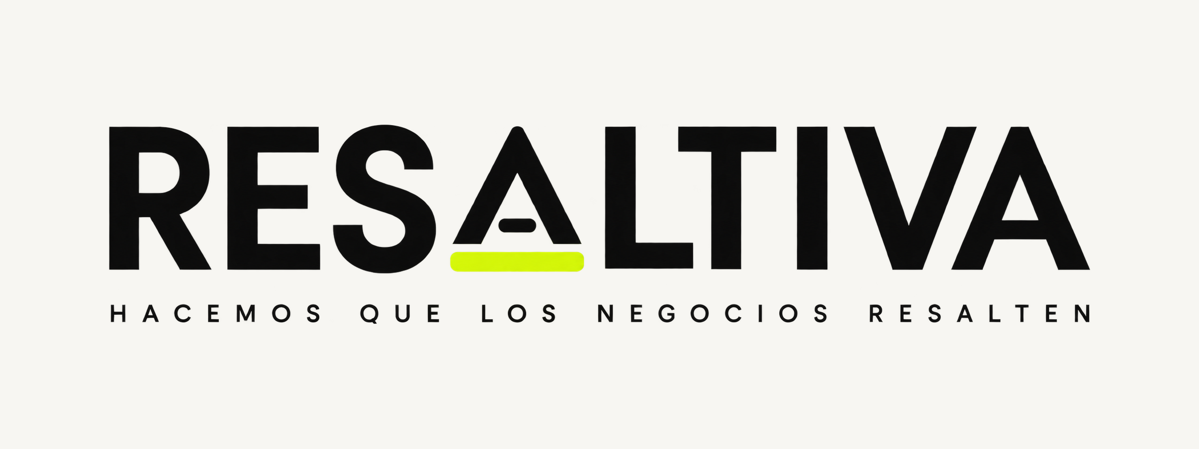
The symbol was not finished on the first attempt. We began with a geometric A above a lime bar. After noticing other symbols with a similar shape, we revisited the inside of the letter and added a small horizontal dash.
We selected the integrated version for the official kit. It retained the underline gesture and connected the symbol to the logic of the wordmark. Another practical review followed: correcting the SVG files and preparing versions for light backgrounds, dark backgrounds and small sizes.

The resulting kit includes logos, the symbol, favicons, an avatar, a social sharing image and colour tokens. These are applications of the identity we created for our own project.
Taking the brand onto the web
The landing page needed to show that creative direction in use. Large typography, space, contrast and highlights moved from the kit into the page composition. Motion became part of the development too, with a brand introduction and transitions accompanying the journey.
We built the website with Astro in Spanish and English, keeping language content separate so it could be maintained. The presentation expanded to include service pages, pricing and a creative glossary explaining terms used in the offer.
We also made the purchasing path more concrete: packages with a defined scope and reusable Stripe payment links. This serves the same intention as the original idea: help a simple need lead to a clear next action.
What we can show today
This is an internal project, following the journey from the service idea to the identity and its digital application. The outcome we show is the brand, its materials and the website. Visual explorations on the homepage are labelled as concepts; they do not represent commissioned campaigns or client results.
We are not presenting sales or conversion figures as an outcome of this case study. Its value lies in following the decisions: what we wanted to offer, why we chose the name, what lime does and how those choices became an experience people can explore.
Resaltiva continues to evolve. This documents the starting point: giving our own brand the attention we want to bring to other businesses.
Explore brand identity · Explore web design · Visit the Resaltiva website